I have four groups to compare, and each group has three samples

L

lunnyisvet

Hello there,

I have four groups to compare, and each group has three samples. So in total, there are twelve samples.

The data set is from testing four different process conditions, and for each condition I tested three samples. The data shows different values (in N) at each displacement.

But I have no idea what I should use for comparing these four groups. Could anyone give me an idea?

Sorry for my English and Thanks in advance!!!


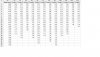
To help your understanding...the data set looks like this:


displacement Group1-1 Group1-2 Group1-3 Group2-1 Group2-2 Group2-3 Group3-1 Group3-2 Group3-3 Group4-1 Group4-2 Group4-3
0.000 0.00 0.00 0.00 0.00 0.00 0.00 0.00 0.00 0.00 0.00 0.00 0.00
0.083 0.09 0.11 0.12 0.04 0.10 0.05 0.07 0.06 0.01 0.03 0.04 0.06
0.167 0.23 0.29 0.27 0.14 0.20 0.17 0.17 0.15 0.12 0.11 0.21 0.24
0.250 0.41 0.52 0.47 0.29 0.35 0.27 0.32 0.26 0.29 0.20 0.32 0.33
0.333 0.53 0.68 0.61 0.43 0.45 0.36 0.48 0.35 0.45 0.27 0.45 0.47
0.417 0.66 0.85 0.73 0.62 0.54 0.50 0.64 0.48 0.60 0.35 0.54 0.57
0.500 0.75 0.96 0.82 0.72 0.60 0.61 0.75 0.55 0.69 0.40 0.67 0.69
0.583 0.83 1.08 0.92 0.82 0.66 0.71 0.86 0.63 0.79 0.47 0.77 0.79
0.667 0.90 1.16 0.99 0.88 0.70 0.77 0.93 0.69 0.86 0.52 0.90 0.91
0.750 0.97 1.24 1.07 0.95 0.75 0.83 1.05 0.75 0.93 0.59 1.02 1.02
0.833 1.01 1.26 1.13 1.01 0.78 0.88 1.11 0.80 0.99 0.65 1.17 1.17
0.917 1.07 1.28 1.20 1.07 0.82 0.94 1.18 0.85 1.07 0.72 1.30 1.30
1.000 1.11 1.32 1.24 1.12 0.85 0.98 1.24 0.89 1.12 0.79 1.46
1.083 1.16 1.36 1.29 1.17 0.88 1.03 1.30 0.94 1.17 0.87
1.167 1.17 1.42 1.32 1.21 0.91 1.06 1.35 0.98 1.21 0.95
1.250 1.17 1.25 1.26 0.93 1.11 1.41 1.03 1.26 1.05
1.333 1.19 1.24 1.29 0.95 1.13 1.46 1.07 1.29 1.12
1.417 1.33 1.33 0.98 1.16 1.51 1.11 1.32
1.500 1.39 1.36 1.00 1.55 1.15
1.583 1.02 1.59 1.20
1.667 1.03 1.61 1.23
1.750 1.04 1.27
1.833 1.29
 

Attachments

  • minitabhelpplz.jpg
    minitabhelpplz.jpg
    116.7 KB · Views: 145
Last edited by a moderator:
B

Barbara B

Hello lunnyisvet,

welcome to the Cove :bigwave:

To get the information out of the data you should first arrange it in a different way:
1 column for displacement
1 column for group number
1 column for sample number
1 column for measurement ("value [N]")
(see attached spreadsheet).

Than you can start comparing groups, e.g. with a boxplot for each group (Graph > Boxplot > With Groups) or by using a main effects plot for data means (Stat > ANOVA > Main Effects Plot).

But these graphs won't adjust for the displacement value and since the displacement values are much higher in Group1 than in Group2, 3 and 4 the pictures could be misleading.

The impact of the displacement on the "value [N]" could be visualized using a scatterplot (Graph > Scatterplot > Simple or With Groups): The higher the displacement, the higher "value [N]", but in a somewhat non-linear way and with an increasing variation. There are no differences between the four groups visible in the scatterplot with groups.

(since the maximum number of attachements is 5, I'll continue in the next posting)
 

Attachments

  • data_lunnyisvet.XLS
    34 KB · Views: 95
  • Boxplot of value [N].png
    Boxplot of value [N].png
    2.7 KB · Views: 147
  • Main Effects Plot for value [N].png
    Main Effects Plot for value [N].png
    3.5 KB · Views: 138
  • Scatterplot of value [N] vs displacement.png
    Scatterplot of value [N] vs displacement.png
    4.7 KB · Views: 163
  • Scatterplot of value [N] vs displacement by groups.png
    Scatterplot of value [N] vs displacement by groups.png
    6.6 KB · Views: 145
L

lunnyisvet

Thanks Barbara!!!

It really helps!

Thank you so much and I really appreciate it :thanx::thanx::thanx:
 
B

Barbara B

(ctd.)

To describe the impact of the groups (process conditions), the samples and the displacement TOGETHER a model is used. This could be done in Minitab via
Stat > Regression > General Regression [available since Minitab R16]
or
Stat > ANOVA > General Linear Model

The models in both menus are (mathematically) the same, the options differ a little bit.

Build a model (you'll find the Minitab project attached in the zip archive):
Stat > Regression > General Regression
Response: 'value [N]'
Model: displacement group
> Graphs: Residual Plots: Choose "Four in One"
> OK > OK

The terms in the Model field (displacement group) are the possible impacts on the response (value [N]).

The residual plots show a parabolic pattern on the upper right side (residuals vs. fits). Therefore a quadratic impact of displacement should be added to the model:
Stat > Regression > General Regression
Response: 'value [N]'
Model: displacement group displacement*displacement
> Graphs: Residual Plots: Choose "Four in One"
> OK > OK

Now the residual plots look better, except for a non-constant variation in the residual vs. fits plot on the upper right side. This is called heteroscedasticity (see Wikipedia reference-linkHeteroscedasticity) and shouldn't be present in a good model.

To stabilize the variation pattern a Box-Cox transformation can be used (see Wikipedia reference-linkBox-Cox_transformation for details). The Box-Cox-transformation can only be applied to positive values (>0), so we add a constant to the "value [N]" (e.g. +0.1) and check if such a transformation yield better results:

Store "value +0.1" in the worksheet:
Calc > Calculator
Store result in variable: 'value +0.1' [single quotation marks are necessary!]
Expression: 'value [N]'+0.1
> OK

Build a model and check if a Box-Cox transformation gives better results:
Stat > Regression > General Regression
Response: 'value +0.1'
Model: displacement group diplacement*displacement
> Graphs: Residual Plots: Choose "Four in One" > OK
> Box-Cox: Check "Box-Cox power transformation (W=Y**Lambda)"
> OK > OK

The residuals vs. fitted plot looks better now. (It should show no pattern in a good model). The session window provides informations about the optimal Box-Cox transformation
Code:
Box-Cox transformation of the response with estimated lambda = 0.541669
The 95% CI for lambda is (0.439169, 0.651169)
Rounded lambda = 0.5 used in the regression analysis

A lambda of 0.5 is the same as using the square root of the response. So in the next model we'll use the square root of the original response "value [N]":

Store "sqrt(value)" in the worksheet:
Calc > Calculator
Store result in variable: 'sqrt(value)' [single quotation marks are necessary!]
Expression: SQRT('value [N]')
> OK

Build a model for the square root of 'value [N]':
Stat > Regression > General Regression
Response: 'sqrt(value)'
Model: displacement group displacement*displacement
> Graphs: Residual Plots: Choose "Four in One" > OK
> Box-Cox: UNcheck "Box-Cox power transformation (W=Y**Lambda)" [we don't need this any more]
> OK > OK

The fourth residual plots look okay, but the residual vs. fits plot shows a non-linear pattern. In addition the Lack-of-Fit test is significant (p=0.0003<0.05):
Code:
Analysis of Variance

Source                        DF   Seq SS   Adj SS   Adj MS        F          P
Regression                     5  20.6407  20.6407  4.12814   505.28  0.0000000
  displacement                 1  16.2452   9.8576  9.85763  1206.57  0.0000000
  group                        3   0.0499   0.4161  0.13870    16.98  0.0000000
  displacement*displacement    1   4.3456   4.3456  4.34561   531.90  0.0000000
Error                        208   1.6994   1.6994  0.00817
  [B]Lack-of-Fit                 69   0.8427   0.8427  0.01221     1.98  0.0003400[/B]
  Pure Error                 139   0.8567   0.8567  0.00616
Total                        213  22.3401

Without any technical knowledge about the process and measurement it is hard to tell whether a more complex model is appropriate. But if a cubic term for displacement is added, the model quality is acceptable:
Stat > Regression > General Regression
Response: 'sqrt(value)'
Model: displacement group displacement*displacement displacement*displacement*displacement
> Graphs: Residual Plots: Choose "Four in One"
> OK > OK

The residuals follow the blue line in the normal probability plot (upper left). (I won't rely on the histogram because its appearance depends highly on the number of bars used and the location of the bar limits.) In the residual plot residuals vs. fit only a slight pattern is visible now. The pattern in the plot residuals vs. observation order (bottom right) is still present and could be caused by heating/cooling of the measurement system or other systematic effects in the process.

Code:
Lack-of-Fit test: p=0.9112 > 0.05
(no lack of fit detectable)

Code:
R?=94.77%, R?(adj)=94.62%, R?(pred)=94.37%
(model explains the response quite well with a high prediction quality)

A significant impact on the response sqrt(value) is present for all model terms (group, displacement, quadratic displacement, cubic displacement) and the differences between the groups can be seen in the regression equations (session window):
Code:
Regression Equation

group
Group1  sqrt(value)  =  0,121673 + 2,33448 displacement - 1,81231
                        displacement*displacement + 0,467946
                        displacement*displacement*displacement

Group2  sqrt(value)  =  0,0388895 + 2,33448 displacement - 1,81231
                        displacement*displacement + 0,467946
                        displacement*displacement*displacement

Group3  sqrt(value)  =  0,045901 + 2,33448 displacement - 1,81231
                        displacement*displacement + 0,467946
                        displacement*displacement*displacement

Group4  sqrt(value)  =  0,0190389 + 2,33448 displacement - 1,81231
                        displacement*displacement + 0,467946
                        displacement*displacement*displacement

If you want to illustrate these differences, the General Linear Model function can be used:
Stat > ANOVA > General Linear Model
Response: sqrt(value)
Model: displacement group displacement* displacement displacement* displacement* displacement
> Covariates: displacement [the numeric terms must be filled in here] > OK
> Graphs: Residual Plots: Choose "Four in One" > OK
> Factor Plots: Main Effect Plots: Select "group"
> OK > OK

The main effects plot shows that the mean in the first group (Group1) is much higher than the means in the other three groups. This main effects plot is build based on the model (see subtitle "Fitted Means"), meaning it shows the differences between the groups without the displacement impact.

What statistical analysis couldn't answer is if this model makes sense from a technical point of view, why the process conditions in Group2, 3 and 4 were only tested with smaller displacement values than in Group1 and what causes the pattern in the residuals vs. observation order plots.

Hope this helps nevertheless :)
 

Attachments

  • Analysis lunnyisvet 2012 09 24.zip
    356.4 KB · Views: 116
L

lunnyisvet

(ctd.)

What statistical analysis couldn't answer is if this model makes sense from a technical point of view, why the process conditions in Group2, 3 and 4 were only tested with smaller displacement values than in Group1 and what causes the pattern in the residuals vs. observation order plots.

Hope this helps nevertheless :)

Thanks Barbara :))

The reason the displacement values are different is that I was testing for the tensile strength. So the displacement shows what length the sample got broken when they were stretched out. :)
 
Top Bottom