How would you use specification lines to help visualize whether or not a process is stable? The data for spec lines come from the customer, management, or engineering to indicate the allowable spread. Spec limits do not come from the process, so how can they communicate anything about the stability of the process? Control limits help assess process stability because the data is from the process.
Indeed, the spec lines come from the customer, or regulations or management's desires to improve (and what takes priority to improve).
BUT we must separate the functions of the specification limits and the control. limits. The control limits tell me if the process is in control or not. The specification limits tell me if I am meeting specs. This gives us four possibilities, as compared to Dr. Deming's Red Bead Experiment:
1. The process is stable and not meeting specs. This is the usual state for the red beads - the average is 10 red beads, the lower control limit 1 and the upper control limit is 19. I plot the stated goal of 3 (which yes may be from pull it out of your you know what) and see the UCL and the average is above 3, so I am never going to meet the goal of 3 without a process change.
2. Let us say we remove some of the red beads from the bucket. In this case, it is "easy" to remove the beads, in reality, it will take some work to identify the proper changes. We get an improving trend - let us say 7 below average (or 8, or 9 depending on your author). We have a process not yet meeting the spec, but we have imparted momentum - we have an improving trend. Not stable, not meeting the spec, but heading in the right direction.
3. Let us say we removed enough beads to have the UCL be less than 3. And we have enough data and knowledge to declare the process stable. Now we have a stable process (GOOD) and a process that is consistently meeting specification (DOUBLE GOOD). We want to stay here. Though should hold out that management could yet decide that less than 3 is not good enough, and desires to lower the spec to zero. Then we go back to step 2..
4. Now let us say (this is a real story from the desert of Washington state) it is a dry day, low humidity, and all red beads are attracted to the paddle and the white beads are repelled. We now exceed the upper control limit established in step 3, perhaps or perhaps not exceeding the specification. I now have an Unstable Process which is heading the wrong direction against the Specification. VERY BAD. But I find a can of anti-cling spray and spray down the beads and all returns to normal (step 3).
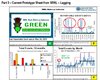
Attached is a slide from a publicly-cleared presentation of a real example. Notice the lower right hand chart illustrates an SPC chart with a one sided specification (the dotted green line) and we can see the trend of performance getting worse with time, which we were taking action on (and some of it was being more aware of reporting events). Note the Pareto Chart in the lower left to identify the source of events.
I will admit the stoplight in the upper left corner was less useful, it was just based upon days since last event, not the trend.