I

- Home
- Forums
- Common Quality Assurance Processes and Tools
- Quality Tools, Improvement and Analysis
- Quality Assurance and Compliance Software Tools and Solutions
- Excel .xls Spreadsheet Templates and Tools
You are using an out of date browser. It may not display this or other websites correctly.
You should upgrade or use an alternative browser.
You should upgrade or use an alternative browser.
Q
qualeety
how to add a line in the excel graph
the easiest way is to add a line is to click the following:
INSERT -> PICTURE -> AUTOSHAPES -> LINE
click on the line icon and draw a line on the graph.
Hope that helps.
the easiest way is to add a line is to click the following:
INSERT -> PICTURE -> AUTOSHAPES -> LINE
click on the line icon and draw a line on the graph.
Hope that helps.
Tim Folkerts
Trusted Information Resource
If you want Excel to actually put a vertical line at a specific location on the graph (e.g. 3.2 kg) for you, then you may have to redo the graph a bit.
Bar graphs don't treat the x-axis as actual numbers, so you can't tell it to plot someting extra at a specific value. If you change to an X-Y (scatter) plot, then there are ways to add extra lines using an extra data series. However, then you get individual points for the date, rather than the more distinct bars.
A couple other quick comments.
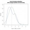
* A lognormal fit seems a bit closer to the data you have: a sharp tail at the lower end and a broad tail at the upper end.
* You clearly have two peaks in the data - one near 1.5 and one near 3.0. You might try fitting two normal curves (or two lognormal curves) to better match what is actually happening.
* I think there may be a minor error in the equation you used to draw the fit line. I could describe it here - or in a private message if you prefer.
Tim F
Bar graphs don't treat the x-axis as actual numbers, so you can't tell it to plot someting extra at a specific value. If you change to an X-Y (scatter) plot, then there are ways to add extra lines using an extra data series. However, then you get individual points for the date, rather than the more distinct bars.
A couple other quick comments.
* A lognormal fit seems a bit closer to the data you have: a sharp tail at the lower end and a broad tail at the upper end.
* You clearly have two peaks in the data - one near 1.5 and one near 3.0. You might try fitting two normal curves (or two lognormal curves) to better match what is actually happening.
* I think there may be a minor error in the equation you used to draw the fit line. I could describe it here - or in a private message if you prefer.
Tim F
B
Barbara B
Additionally to Tim's subsequent posting: I suggest three peaks in your values, one at 1.16, one at 1.43 and one at 2.89. Your values couldn't be approximated with a normal curve (see attached pics).
Before fitting any curve, you could think about differences in the data. Maybe your data comes out of three different samples or were produced with different machines or something like that.
That's not what you've asked") , but perhaps it will be helpful.
, but perhaps it will be helpful.
Barbara
Before fitting any curve, you could think about differences in the data. Maybe your data comes out of three different samples or were produced with different machines or something like that.
That's not what you've asked
, but perhaps it will be helpful.Barbara
Attachments
Tim Folkerts
Trusted Information Resource
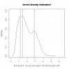
Like Barbara, I tried to create a fit to the curve (I used Excel). I didn't try 3 peaks, mostly because the scatter in the data seemed large enough to swamp the need for a third peak. And fitting one more peak would make the process more difficult to do semi-manually!
Even with just two peak, you can get a pretty good fit. The curve is in the attached file.
Tim F
Even with just two peak, you can get a pretty good fit. The curve is in the attached file.
Tim F
Attachments
B
Barbara B
Tim,
of course it is easier to approximate the values with two curves, but it could mask sometimes the underlying special causes which leads to the three peaks.
So my suggestion is to look for those special causes first and then try to approximate the values with an appropriate number of curves.
If the data is not normally distributed, the use of xbar-R-charts is not a good tool to track the process output (directly without any transformation).
Regards,
Barbara
Tim Folkerts
Trusted Information Resource
Barbara,
Interesting! It is sort of like the chicken and the egg question. Which should come first - the theory that predicts the behavior of the curves, or the analysis of actual data without any preconceived notions of what to expect. Both are viable approaches.
In this case, since I had no a priori reason to believe that there are 3 peaks, I settled for two. And just by eye it gave a pretty good fit. (Actually I used a least-squares approach to get the best fit). Looking at the residuals might give a good idea whether 2 peaks is enough.
At this point, though, if Indul doesn't come back and give some feedback, I think I'll mostly let this thread hibernate. We are probably giving him more than he wanted!
Tim F
B
Barbara B
Tim,
poor Indul He ask a simple excel question and we start to discuss about curve approximations... Sorry for hijacking your thread Indul, perhaps you'll although find some useful hints in our postings.
For me the decision between two or more curves is not an chicken/egg-thing. From Indul's spreadsheet you could see, that his intention is to draw a Xbar-R-chart. For this charts the assumption of normally distributed data had to be true to get valid results.
So if you're trying to track a process with Xbar-R-charts (or any other tools with the assumption of normality), you have to check this assumption first. Indul's values are not normally distributed, so what could he do?
1. He could use a transformtion of the data or the distribution (lognormal or something like that), but there are no hard rules to get the "right" solution here out of the data without additional informations. Maybe he'll get something normally distributed at the end, but he'll throw away a lot of valuable information.
2. He could use two curves to get a good fit of the data. But what does that mean for his process? How could he decide whether a new value like 2.2 belongs to the first or second distribution without informations about the cause for the two distributions?
3. He could use sample-subgroups. If the expected mean and variance of the process are stable, he'll get normally distributed values (Central Limit Theorem). But he had no information about the causes for the peaks in the original data.
4. He could go back to the process and search the cause(s) for the peaks (different materials, machines, suppliers,...) And then he could split the data into useful subgroups with (approximate) normally distributed data and draw Xbar-R-charts (e. g. one for each supplier).
Taking that way he has used the whole information of the data and is able to make stable predictions about the behaviour of the process in future. IMO that is the appropriate use of statistical tools.
Regards,
Barbara
poor Indul
He ask a simple excel question and we start to discuss about curve approximations... Sorry for hijacking your thread Indul, perhaps you'll although find some useful hints in our postings.For me the decision between two or more curves is not an chicken/egg-thing. From Indul's spreadsheet you could see, that his intention is to draw a Xbar-R-chart. For this charts the assumption of normally distributed data had to be true to get valid results.
So if you're trying to track a process with Xbar-R-charts (or any other tools with the assumption of normality), you have to check this assumption first. Indul's values are not normally distributed, so what could he do?
1. He could use a transformtion of the data or the distribution (lognormal or something like that), but there are no hard rules to get the "right" solution here out of the data without additional informations. Maybe he'll get something normally distributed at the end, but he'll throw away a lot of valuable information.
2. He could use two curves to get a good fit of the data. But what does that mean for his process? How could he decide whether a new value like 2.2 belongs to the first or second distribution without informations about the cause for the two distributions?
3. He could use sample-subgroups. If the expected mean and variance of the process are stable, he'll get normally distributed values (Central Limit Theorem). But he had no information about the causes for the peaks in the original data.
4. He could go back to the process and search the cause(s) for the peaks (different materials, machines, suppliers,...) And then he could split the data into useful subgroups with (approximate) normally distributed data and draw Xbar-R-charts (e. g. one for each supplier).
Taking that way he has used the whole information of the data and is able to make stable predictions about the behaviour of the process in future. IMO that is the appropriate use of statistical tools.
Regards,
Barbara
Tim Folkerts
Trusted Information Resource
Barbara,
Perhaps the chicken/egg analogy isn't the best, because I think we basically agree. What I meant was that eggs lead to chickens and chickens lead to eggs; there is no clear, universal answer as to which one should be done first.
I would still tend to start with the data. Untill you see that the data doesn't look normal, there is no point in looking for multiple causes that could be creating multiple peaks.
By the way, I don't agree that a control chart is the goal here. The main hint is the use of the word "Preterm" as the title of his graph within the spreadsheet. "Preterm", along with the concentrations of weights between 1-4 kg (1.5-9 lbs), would lead me to hypothesize that these are birth weights of infants born prematurely. That suddenly makes it all the more important for Indul to get the data analysis right!
Tim
B
Barbara B
Tim,
maybe you're right and Indul's kg-values are birth-weights. But if they are preterms (born before end of 37. week of gestation and/or birth weight less than 2.5 kg) I'm wondering about the 30% of values above 2.5 kg Indul, could you please clarify what the source for your data is? Thanks!
And even if the values are birth weights I would look for the causes of the peaks. At first
Regards,
Barbara
maybe you're right and Indul's kg-values are birth-weights. But if they are preterms (born before end of 37. week of gestation and/or birth weight less than 2.5 kg) I'm wondering about the 30% of values above 2.5 kg
Indul, could you please clarify what the source for your data is? Thanks!And even if the values are birth weights I would look for the causes of the peaks. At first
Regards,
Barbara
Similar threads
- Replies
- 4
- Views
- 225
- Replies
- 0
- Views
- 500
- Replies
- 1
- Views
- 1K