- Home
- Forums
- Common Quality Assurance Processes and Tools
- General Metrology, Measurement Device, Calibration and Test Laboratories
- Gage R&R (GR&R) and MSA (Measurement Systems Analysis)
You are using an out of date browser. It may not display this or other websites correctly.
You should upgrade or use an alternative browser.
You should upgrade or use an alternative browser.
GRR a case study.
- Thread starter New to statistics
- Start date
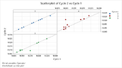
Notice the difference between Operator 1 (no repeatability) and operator 5 (decent repeatability). Also, note the poor reproducibility between them with Operator 1 having consistently higher results than Operator 5.
It's a good idea to review the data visually before diving into the statistics. In this case, you can see there is a problem that must be addressed before performing any statistical analysis.
It's a good idea to review the data visually before diving into the statistics. In this case, you can see there is a problem that must be addressed before performing any statistical analysis.

New to statistics
Involved In Discussions
I believe that is (according to pages 41 & 42)NO I mean a real continuous data scatter plot. See pages 41, 42 and 43 of my MSA presentation. The scatter diagram is on page 43.
ONE plot per operator unless you color code each operator. Each sample has the first reading on the x axis and the second reading on the y axis to form the dot. In your case each plot will have 10 dots.
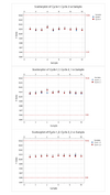
The observations with limits is not clear enough so i also attach
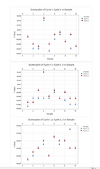
I mean a real continuous data scatter plot. See pages 41, 42 and 43 of my MSA presentation. The scatter diagram is on page 43.
The plots you did are Multi-Vari Plots (as described in the presentation)
The first 3 with the spec limits are the correct plots. You need to see the repeated measurement variation vs. the part to part variation vs. the tolerances. this is exactly what all of the mathematical equations are trying to 'quantify'. Removing the spec limits might make you see the dots 'better' but that isn't the point. In fact perfect (no) measurement error would have the points fall on top of each other. It also distorts the operator to operator differences as the y axes are no longer the same size (a basic violation of graphical display rules). So removing the spec limits doesn't clarify anything - it muddies the view.
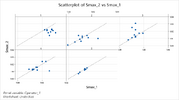
Miner plotted scatter diagrams. and his axes are equivalent for each operator. He is missing the spec limits which artificially 'magnifies' the variation of the repeatability and the part to part variation. But this is a good first pass...
One other point is that the parts selected for the study do not vary much - an MSA should have parts that vary across the natural range pf variation. perhaps your process is that tight but maybe not. The math would say that that "%PV" ratio would be quite bad and would indicate that you can't really apply SPC...
Welshwizard
Involved In Discussions
Hi,
Would it be possible to provide an excel file for the two studies please? I don't use Minitab so can't open the file.
Thanks in advance
Would it be possible to provide an excel file for the two studies please? I don't use Minitab so can't open the file.
Thanks in advance
Added the spec limits for one set. Note that it was a unilateral spec.Miner plotted scatter diagrams. and his axes are equivalent for each operator. He is missing the spec limits which artificially 'magnifies' the variation of the repeatability and the part to part variation. But this is a good first pass...
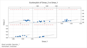
Thanks Miner. Now you know  the next thing is to ditch best fit ? line and a 45 degree line (zero measurement error falls on a 1:1 line and measurement error including bias is displayed about that line. And the plot should be square with equal x and y axes.
The previous plots were square, but after adding the spec line, equal axes would have drastically shrunk the data points into a tiny area. Hard to have both. And those were not best fit lines. They are 1:1 lines.And the plot should be square with equal x and y axes.
This is why I questioned the variation of the parts.The previous plots were square, but after adding the spec line, equal axes would have drastically shrunk the data points into a tiny area. Hard to have both. And those were not best fit lines. They are 1:1 lines.
Similar threads
- Replies
- 1
- Views
- 923
- Replies
- 8
- Views
- 462
- Replies
- 6
- Views
- 1K
- Replies
- 7
- Views
- 2K

