P
prot0912
Hi,
I've just read a few topics here and get a bit of understanding of a subject. However, I still struggling with few issues. So could you please justify if I'm right or wrong.
Introduction :
I have a data related to the printing process and my main tasks are:
-understand if a process in control or not
-if it's in control, then estimate if process capable or not
-data measured continuously on the 5 min time interval, during 2 shifts, between different printing stations (overall number of stations - 9, but during different shifts, only a few are in use) and teams. I need to find out if there are any problems related to specific station or team.
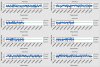
You could find data sample for one particular team in the attachment.
Questions:
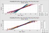
To understand if a process in control or not, I used Control Charts. According to it, I chose Xbar-S chart, because my data are split into 2 groups - which is shifts(runs), so it means that I need to analyse it separately. In addition, my data are measuring 2 parameters(alignment) Rx and Ry for each particular station in use, so my subgroup size more than 8.
So question is, did I choose right control chart to get an overall understanding if a process in control or not?
Should I check control charts Xbar-S for each parameter Rx and Ry for each of the stations separately?
Since my data measured continuously in time and I have 137 samples could I use bigger subgroup size for example 12 ( large subgroup size - mean lower(better) control limits right?) or I need to use something totally different?
Is it right way to use capability analysis with normal distribution and subgroup size 1, for my case, for each parameter (Rx and Ry) and each station - to understand if process capable and meet specifications limits from client (+/-0,175 both for Rx and Ry), or there is better way to combine all of it within one graphic?
What is the best way, based on, data to compare performance across shifts/teams/stations/ parameters Rx and Ry?
My apologies for such amount of questions, but it seems to me that there are plenty of different ways to analyse this data, so I kind of struggle to find out wich one is straightforward and the proper(best) one.
Thank you.
View attachment Data011.xls
I've just read a few topics here and get a bit of understanding of a subject. However, I still struggling with few issues. So could you please justify if I'm right or wrong.
Introduction :
I have a data related to the printing process and my main tasks are:
-understand if a process in control or not
-if it's in control, then estimate if process capable or not
-data measured continuously on the 5 min time interval, during 2 shifts, between different printing stations (overall number of stations - 9, but during different shifts, only a few are in use) and teams. I need to find out if there are any problems related to specific station or team.
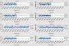
You could find data sample for one particular team in the attachment.
Questions:
To understand if a process in control or not, I used Control Charts. According to it, I chose Xbar-S chart, because my data are split into 2 groups - which is shifts(runs), so it means that I need to analyse it separately. In addition, my data are measuring 2 parameters(alignment) Rx and Ry for each particular station in use, so my subgroup size more than 8.
So question is, did I choose right control chart to get an overall understanding if a process in control or not?
Should I check control charts Xbar-S for each parameter Rx and Ry for each of the stations separately?
Since my data measured continuously in time and I have 137 samples could I use bigger subgroup size for example 12 ( large subgroup size - mean lower(better) control limits right?) or I need to use something totally different?
Is it right way to use capability analysis with normal distribution and subgroup size 1, for my case, for each parameter (Rx and Ry) and each station - to understand if process capable and meet specifications limits from client (+/-0,175 both for Rx and Ry), or there is better way to combine all of it within one graphic?
What is the best way, based on, data to compare performance across shifts/teams/stations/ parameters Rx and Ry?
My apologies for such amount of questions, but it seems to me that there are plenty of different ways to analyse this data, so I kind of struggle to find out wich one is straightforward and the proper(best) one.
Thank you.
View attachment Data011.xls